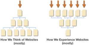
Think of a website like a storefront.
No one loves analogies more than I do. I’ve even used analogies to explain analogies. But sometimes they can be dangerous. If an analogy provides a mental model that mostly fits, it can blind a person to important truths.
A website is like a storefront, and it is nothing like a storefront. A storefront has one main entry point. A person can evaluate the storefront from the outside. A store owner has a large degree of control over the experience people have as they walk through the door. A website has many entry points. In fact, visitors coming from search engines and social media sites rarely come through the front entrance. In the case of TwoOctobers.com, 14% of visitors land on the home page.
Web designers often create a user experience that assumes visitors will see the home page of a site. In the worst cases, basic information establishing credibility and business focus only exists on the home page. When you think about how people are experiencing your site, you could be doing yourself a disservice.

Designing for Entry Page Behavior
A few things to think about when designing pages and navigation:
- Watch for hot entry pages and spend a little extra time on those. On this site, The Top 10 Free Places to List Your Business is the number one entry point. I’ve already gone back a few times to improve the post and tune the user experience. And I should probably be doing more. It is likely that your site has similar such entry points. Do you have a dusty old blog post or service description page that garners a lot of traffic? Spruce it up! Link to other related and popular content from that page, and consider adding text that explains who you are and what you do.
- Don’t think of navigation as a hierarchy of categories (unless you are in the hierarchy-of-categories business), think of it as signage. Good signage doesn’t try to tell you where everything is all the time, it focuses on what is close by or likely to be important to you.
- Allocate design effort based on how people are using your site. Joshua Porter of User Interface Engineering proposes an approach that is the inverse of most people’s thinking: visitors spend most of their time deep in site content, so spend less time on your home page and more time improving the user experience of popular content sections. Read his article Prioritizing Design Time: A Long Tail Approach for a better explanation.
Data points on this topic – check out the articles too, they’re very good:
- Andrew Hanelly of TMG Custom Media looked at web traffic for 20 different sites. For most, the home page was the entry point for fewer than 20% of visitors.
- Joshua Porter found that the home page accounted for less than 10% of page views on www.uie.com.
- Gerry McGovern, author and CEO of Customer Carewords reported on a general trend of diminishing traffic to sites’ home pages. I also really like Louise Hewitt‘s suggestions in the comments:
- Usability test from a non-specific location (e.g. a blank desktop) and ask the user to complete the task.
- Present sub-page wireframes first and then ‘collect together’ with a home page at the end of the design presentation.
- Include non-page based designs for user journeys that start before the site is accessed and end after it.


Excellent points Nico.
I immediately thought of your writeup here when I came across this post today, which provides even more backup to your thoughts regarding the importance of homepages: http://uxmyths.com/post/717779908/myth-the-homepage-is-your-most-important-page