In this blog post, I’ll walk you through creating a report in Looker Studio that shows how many keywords your website is ranking for in different position ranges on Google Search. We’ll use the Google Search Console connector, a case statement, and a data blend to achieve this, meaning you’ll get a great visualization of current and historic ranking using free tools.
This is what the finished chart looks like:
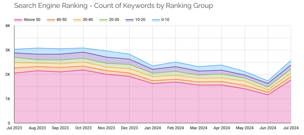
I think this is a much more useful visualization than tracking individual keyword rankings. Businesses often want to track the performance of a short list of specific keywords relevant to the products or services that the business sells, but it is well established that the vast majority of search activity is comprised on long tail queries that will never appear on such a list.
So, understanding the total number of keywords you are ranking for is a much better indication of how your content efforts are paying off. After looking at these charts for a number of clients, I’ve observed that Google doesn’t tend to rank new content in top positions. It is much more likely that you will first show up with an average position in the ‘Above 50’ range. Because listings that far down the results rarely get clicks, you will see the ‘Above 50’ band in this chart start to grow well before you see an impact in traffic to your site. Conversely, if you see the number of queries you are ranking for start to shrink, it’s a warning that you will start losing traffic if you don’t turn things around.
Watch this video walkthrough or continue scrolling to follow the written steps.
Step 1: Add Your Google Search Console Data Source
First, add the Google Search Console data source to Looker Studio:
- Go to Resource > Manage Added Data Sources.
- Click ‘Add a Data Source’. Scroll down and select Search Console.
- Search for your site and select the table ‘Site Impression’ and Search type ‘web’.
- Add the data source to your report.
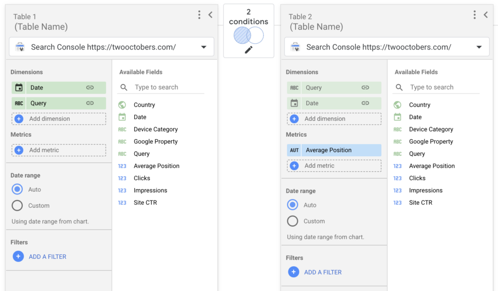
Step 2: Create a Data Blend
This step is kind of weird, but the case statement we will be using in Step 3 to group queries into position ranges doesn’t work if you try to apply it directly to the Search Console data source. The reason is that a case statement can’t take metrics as arguments and return a dimension value. When you create the data blend, the Average Position metric will convert to a dimension and the case statement will work.
Learn more about using Blends in Looker Studio.
To create the blend:
- Go to Resource > Manage Blends.
- Add a new blend:
- Select your Search Console data source.
- Add Date and Query as dimensions. Don’t add any metrics.
- Click ‘Join another table’ and add the same data source again:
- Add Date and Query as dimensions. (If there are other Dimensions preloaded, like Google Property, remove them.)
- Add Average Position as a metric.
- Click ‘Configure join’ and select Left outer and match Query to Query and Date to Date.
- Name this blended data source ‘GSC Self Blend’ and save.
The blend will end up looking like this:
Close the blend window.
Step 3: Create a Stacked Area Chart
- Insert a new Stacked Area Chart.
- Set the data source to ‘GSC Self Blend’.
- If it didn’t populate automatically, set the Dimension to ‘Date’.
- Under ‘Breakown Dimension’, add a new field named Position Group and set the formula to the following case statement:
CASE
WHEN Average Position <= 10 THEN "0-10"
WHEN Average Position <= 20 THEN "10-20"
WHEN Average Position <= 30 THEN "20-30"
WHEN Average Position <= 40 THEN "30-40"
WHEN Average Position <= 50 THEN "40-50"
ELSE "Above 50"
END - Set the metric to ‘Query’. It will automatically select ‘CTD’ as the aggregation type, which will produce a count of unique query values.
Step 4: Refine the Chart
At this point, you can configure the chart to your taste. A few things I like to do:
- Set the default date range for the chart to 12 months. The default ‘last 30 days’ isn’t enough to see significant changes in Google.
- Under Dimension, enable Drill down, then add the ‘Date’ dimension again, and change the Data type to Date & Time > Year Month. Then set the default drill down level to Year Month.

Hey, thanks for this Nico – Great tutorial! I’ve been trying to do this with URL level Search Console data (rather than site), as I want to filter it to only show the stacked rankings for a specific group of pages rather than the whole site. Everything works fine until I want to extend the date range beyond the default 28 days, then it breaks the chart. Any ideas if this is something that is possible, and what the problem could be?
It is definitely possible. Filters, blends and long date ranges don’t always play well together, but here are a couple of things to try:
1. If you are not already, try adding your filter to each data source in the blend, versus adding it to the chart.
2. If that doesn’t work, try creating an Extract Data data source of the GSC data, and include the filter in the Extract Data config. Then create the blend from the Extract Data source.
Thanks for this, super helpful! One minor issue I am having. I cannot get the position groups to sort as you have in the chart. The Above 50 appears in the middle of the groups after 10-20. I have tried putting the case statement in a different order, changing the sort order on the breakdown dimension – no matter what i do the ‘Above 50’ always shows up in the third position. I tried changing the name to 50+ and it still is in the third position?
If you set your ‘Breakdown dimension sort’ to Position Group it should sort correctly, as long as you name the groups similar to what I did in the video. Let me know if that doesn’t work.
Thank you! Yes, I was hasty and missed that. That does work. cheers!