How to adjust GA4’s prebuilt reports to view the data you need
The Reports menu of GA4 has some good starting-place reports, but they do have some frustrating components. The fairly useless charts at the top and the always-too-small-to-view table below don’t make it an ideal place to explore. However, it may be time to take another look. Here’s a look at features that can make these reports more useful.
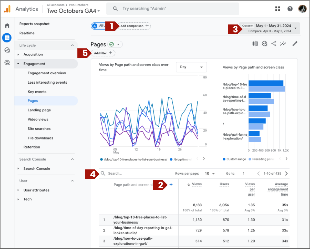
Log in to Google Analytics and go to Reports > Pages and we’ll walk through a few ways to dig deeper into the data.
Comparisons

Add a comparison using any dimension. Let’s look at pages visited by users who came from organic search and organic social.
- Click Add comparison above the report title.
- Select Dimension: Session source / medium, exactly matches, and google / organic.
- Click Apply.
- Then click Add comparison again to add a second comparison for organic social.

Add more detail to the table rows, for example to see the number of page views for each by source/medium.
- Click the plus button next to the column header “Page path…”
- Add Session source /medium as a secondary dimension.

Compare data in two different date ranges inside the date control.
Filters

Use the search box above the data table. This is useful to look for a single page, or to narrow your view to a subset of pages, like your /blog/ directory.
It’s also one way to get better value from the time-series chart, too–to find out when new page when live or a new event started working, search for it by name in the Pages or Events report, and use the chart to see when it began tracking.

Use the Add filter button up by the title of the report to filter by traffic source, geography, or demographics. For example, you could see which pages users visited in a geography matching a trade show where your business recently exhibited.
Questions you can answer in GA4 reports
With the comparison and filtering options, you can answer lots of interesting questions. Here’s some ideas.
- Search for a specific page by name to see in the graph when it started getting traffic.
- See which sources send more traffic to a specific landing page. This might
- Filter to see all the pages underneath one subdirectory, and see which have better engagement rates.
- What websites sent us referral traffic?
- What are the top product pages viewed by state?
- What was the engagement rate of users visiting from the August newsletter, versus the July newsletter?
- Which are the most popular blogs for male vs. female website visitors?
- What is the top traffic channel for our most important events?
- On what pages was a key event triggered?
Hopefully these examples get some ideas flowing. Happy exploring!